This year’s Five Flashiest Fleets honorees perpetuate their brands with humor, perspective
Whether they’re promoting a brand, pushing a product or recruiting drivers, fleets employing trailer graphics are able to capitalize on a mobile marketing platform that gives them a leg up on the competition. Granted, the design and production of fleet graphics isn’t cheap, but fleets willing to spend the extra coin have their message well-positioned for a captive audience – the motoring public.
Each year, Commercial Carrier Journal is proud to host its Five Flashiest Fleets competition recognizing the best fleet graphics in the industry. This year’s crop of finalists epitomize what all graphic designs aspire to create – clean lines, bright images and, in three cases, appetite-inducing imagery.
The judges for this year’s competition include CCJ’s staff as well as editors and art directors from its sister publications Truckers News, Overdrive and Custom Rigs. Together, we pored over the most entrants we’ve received in several years and emerged with five finalists. Each voter’s scores were weighted to determine a final ranking.
Without further ado, here are the winners of CCJ’s 2010 Five Flashiest Fleets.
#5 Taking the brand to the road
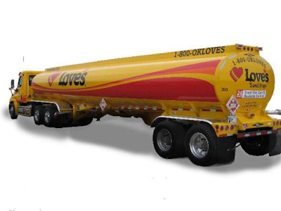
Graphics designer: Love’s Travel Stops & Country Stores, Oklahoma City
Graphics producer: Mountain Graphics, Houston
The Love’s tanker design is an extension of a companywide rebranding effort for the travel stop giant. Clean lines, bright colors, gentle curves and tractor integration – as well as a large brand presence – sets this design apart.
“We want our customers and competition to see that we are constantly improving ourselves,” says Mike Goldberg, compliance manager for Gemini Motor Transport. “Both our drivers and customers love it based on all the feedback we’re getting.”
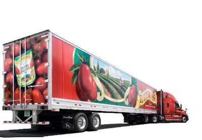
Carrier: RG Transport Inc., Elwood, Ind.
Graphics designer: Clarity Cloverdale Fury Agency, Minneapolis
Graphics producer: TKO Graphix, Plainfield, Ind.
Rolling hills and expansive vineyards aim to connect the viewer to the rich Italian heritage of Tuttorosso Brand of Tomato Products. The well-executed design and bright-red produce on the rear of the trailer combine to create a stunning visual.
According to Red Gold marketing manager, Greg Metzger, the intent of the design is to “break through the clutter and create consumer exposure to our Italian-positioned Tuttorosso brand in a dramatic manner.” Dramatic indeed.
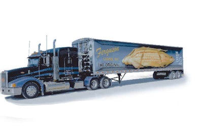
Carrier: Ferguson Farms Inc., Leesburg, Ind.
Graphics designer: Ferguson Farms Inc.
Graphics producer: Epic Media Group, El Segundo, Calif.
In the seed corn business, the gentler you treat the corn in transit, the better. Ferguson Farms bucked the trend of dump trucks and open trailers 26 years ago in favor of live floor trailers, which help meter the load and reduce damage during delivery at the plant.
Inspired by a previous Five Flashiest Fleets honoree, Ferguson came up with the design idea of strapping an oversized ear of corn to the trailer, reinforcing the steps with which it cares for its cargo. “ ‘The Next Big Step’ has to do with the trailer’s ability to ‘walk’ the corn,” says Bob Ferguson, president of Ferguson Farms.
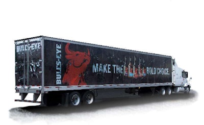
Carrier: Kraft Foods/Bull’s-Eye, Madison, Wis.
Graphics designer: DraftFCB, Chicago
Graphics producer: Modagrafics, Rolling Meadows, Ill.
Cargo securement issues aside, the thought of a manic bull loose inside a trailer is certainly going to grab some attention. Judges particularly liked the execution of three-dimensional piercings in the trailer by the bull’s horns.
With the tagline “Make the bold choice,” the designers certainly know their target audience. “The type of barbecue sauce that you choose says a lot about the type of man you are,” says Aryanne Israel, art director for DraftFCB. “Bull’s-Eye barbecue sauce is for bold men.”
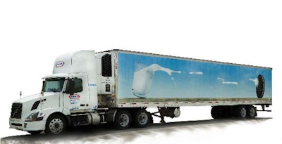
Carrier: Kraft Foods/Oreo, Madison, Wis.
Graphics designer: DraftFCB, Chicago
Graphics producer: Modagrafics,
Rolling Meadows, Ill.
The clever idea behind this year’s top fleet graphic was to illustrate how milk and Oreos – arguably the best food/drink pairing in history – translate to the open road. The speed of the truck causes the milk to spill in the direction of the Oreo.
“The design reinforces the one-of-a-kind relationship between Oreo and milk to consumers,” says Glen Pierce, vice president and production supervisor for DraftFCB. “And, hopefully, makes them smile. Because who wouldn’t want to see a giant Oreo cookie cruising next to them on the highway?”
Others receiving votes
Here’s a sampling of other judges’ favorites that didn’t place in the top five …


