
Since 1978, CCJ has been proud to recognize excellence in fleet graphics design and execution. The judges for this year’s competition included CCJ’s editorial and art design staff. Each judge ranked their top 10, and scores were weighted to determine a final ranking.
Here are this year’s Five Flashiest Fleets, whose outstanding graphics best represent their products and services and take advantage of the opportunity to set them apart from the competition. By Jeff Crissey
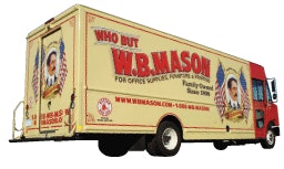
Graphics designer: W.B. Mason Co. Inc.
Graphics producer: Lowen Graphics
Founded in 1898 by William Betts Mason, W.B. Mason Co. introduced free delivery using a one horse-drawn wagon, adorned with a large image of the face of W.B. himself. Today, W.B. Mason has grown to be the largest privately held office products dealer in the United States with a fleet of more than 450 trucks delivering out of 43 warehouses.
“Our logo depicts the all-American image of W.B. Mason himself,” says John DiLuna, corporate fleet and safety manager. “To this day, we continue to provide the same personal ‘same day’ delivery as Mr. Mason did 114 years earlier. The fleets of W.B. Mason are rolling billboards. The colorful graphics are part of our company culture. It is important to us to keep our units clean and well maintained.”
Why we liked it: “CCJ has been covering trucking since the industry’s birth. That’s why I rated W.B. Mason’s fleet so highly: The trucks remind me of the turn-of-the-century vibe that is found in the early days of trucking that is captured so well by CCJ in its formative years.”
– Jack Roberts, CCJ executive editor
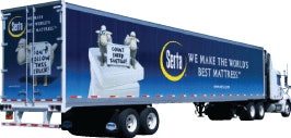
Carrier: Serta International
Graphics designer: Serta International
Graphics producer: Modagrafics
Serta International had a two-part goal for its new 2012 fleet graphics. First, they wanted to highlight the mattress maker’s fun and memorable national advertising campaign – The Serta Counting Sheep. Serta dedicated two sides of its fleet graphics package to the ever-popular Counting Sheep featuring clever messages warning consumers to consider counting sheep instead of purchasing a Serta mattress.
Secondly, Serta wanted to bring further consumer awareness to its latest breakthrough product brand, the iComfort Sleep System. The iComfort graphics feature a clean design approach fitting with the overall brand integrity. It features the modern brand logo and tagline “Smarter. Cooler. Better.” along with vibrant product photography.
Why we liked it: “I like Serta’s concept because it ties in to its entire marketing campaign. There is no doubt from a great distance whose truck it is, and the clean, bold graphics and colors draw the eye.”
– Kathleen Buccleugh, CCJ online managing editor
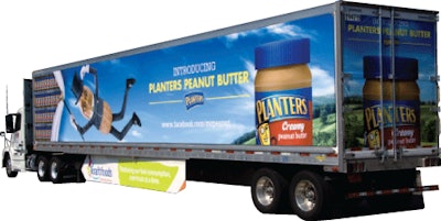
Carrier: Kraft Foods Global Inc.
Graphics designer: BEING
Graphics producer: Modagrafics
Planters released its new peanut butter product in late 2011 and wished to get as much exposure as possible in the Midwest market. Since the company was a new face in the peanut butter aisle, the graphic depicts shelves full of the new Planters Peanut Butter.
To keep the product with a fresh new look, changeable Flexmount side panels were used to allow for an update of promotional advertising in late 2012.
Why we liked it: “The farm under a blue sky is visually appealing. The Planters character effectively captures the role of the carrier to swiftly move the product from the farm to the store to preserve the taste and freshness.”
– Aaron Huff, CCJ senior editor
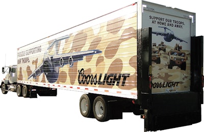
Carrier: MillerCoors
Graphics designer: Integer Group
Graphics producer: Modagrafics
In 2012, MillerCoors rolled out this striking trailer graphic to show its support for U.S. troops. Camouflage is a hard design element to pull off, but with muted tones and striking, forceful images, this concept hits home.
“The concept behind these graphics was to display a design that would speak directly to MillerCoors’ consumers,” says Charissa Quezaire, marketing coordinator for Modagrafics. “They believe that everyone who sees this design circulating throughout the United States will feel proud to be an American – just like they are!”
Why we liked it: “What struck me first about the rig was the camo-based motif. Then I noticed the crisp vector-based imagery, the bold clean lines of the planes, and the Hummers that create a very post-modern pop art appearance. Plus, you can’t lose when using our military in advertising. Patriotism is something that will never go out of style.”
– David Watson, CCJ art director

Carrier: Ace Hardware Corp.
Graphics designer: GSD&M

To promote Ace Hardware’s new line of paint, the company devised a truck wrap that explores paint and painting through a creative illusion. The truck’s walls appear to be clear so that the viewer can see the interior in the process of being painted by several people. Depending on which side of the truck is being observed, the scene shifts accordingly to keep the illusion consistent.
Why we liked it: “Ace’s concept caught my eye for two reasons – the sentimental aspect of a family doing a home improvement project is good marketing to all on-highway passers-by, and the simple utilization of the trailer itself to create a three-dimensional effect with depth of field works very well.”
– James Jaillet, CCJ news editor






![Img 9401[87]](https://img.ccjdigital.com/mindful/rr/workspaces/default/uploads/2026/05/img-940187.vJq7SVGjUK.jpg?auto=format%2Ccompress&fit=crop&h=167&q=70&w=250)
