


A lot of time and effort goes into spec’ing a commercial truck, but much of that work goes unappreciated by the untrained eye. Well-executed fleet graphics, on the other hand, not only project a largely positive image, they also are more obvious than a finely tuned axle ratio or a calculated aerodynamics package.
Trucks and trailers are a canvas with unlimited possibilities for showcasing a company’s heritage, its values and its strengths, and they are a carrier’s most visible – and most mobile – means of marketing.
Since 1978, Commercial Carrier Journal has recognized excellence in fleet graphics design and execution among carriers willing to invest in their own imagination.
The judges for this year’s competition included a 15-person panel from the editorial, art design and marketing staffs of CCJ and fellow Randall-Reilly publications Overdrive, Trucks, Parts, Service, Successful Dealer and Truckers News.
Each judge ranked their top five out of 70 submitted entries, and scores were weighted to determine a final ranking. The five submissions this year successfully relate the company’s purpose, tell a story, champion a cause or promote a strong corporate brand image.

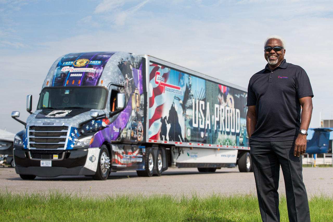

5. Proud to be an American
CARRIER: Cargo Transporters, Claremont, N.C.
GRAPHICS DESIGNER: Hyperformance Graphics
Cargo Transporters Inc. (CCJ Top 250, No. 182) specializes in time-definite or JIT/expedited freight and uses eight of its more than 1,400 assets to honor the company’s servicemen and women and all American enlistees.
“A large percentage of our employees are veterans,” said Shelley Dellinger, marketing and public relations manager for Cargo Transporters. “We wanted to display our support for all those who have served in our military forces by providing a matching themed trailer to our Ride of Pride tractors. These tractors and trailers are requested to provide a visual reminder to the public at numerous events throughout the year.”
WHY WE LIKED IT: “There’s a lot going on in this package but in a good way. It hits practically every patriotic/military theme – the flag, the digital camo, the bald eagle, the Purple Heart and so much more – without looking too busy. And each unique element stands out on its own, which is really remarkable considering all the components within the graphic itself.” – Jason Cannon, CCJ editor

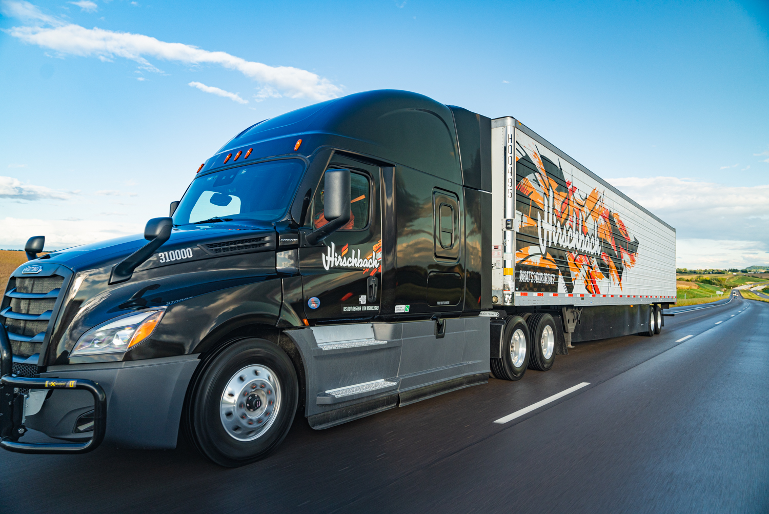


4. A different kind of look for a different kind of company
CARRIER: Hirschbach Motor Lines, Dubuque, Iowa
GRAPHICS DESIGNER: Hirschbach Motor Lines
For the last 85 years, Hirschbach Motor Lines (CCJ Top 250, No. 64) has prided itself on being a privately owned carrier with a fleet of the newest, most environmentally friendly and fuel-efficient trucks in the industry. Hirschbach hopes its new bright, high-contrast graffiti-styled graphics convey just how modern the carrier is and set the truckload carrier apart in a crowded field.
“We want people to notice we are a different kind of trucking company,” said Bianca Sanchez, marketing and social media manager for Hirschbach. “We invest in top-of-the-line equipment, offer top-notch pay packages and foster a company culture that is unmatched.”
The graphics package currently is installed on about 10% of the company’s trucks and trailers, but Sanchez said as older equipment is phased out for new, the updated graphics are included, “and the numbers with the new look are going up.”
WHY WE LIKED IT: “Hirschbach’s look is distinctive, bold and unique in every way. The elements complement each other: the colors, the font, the graphics. Combined they convey an impressive image of the company, and beg to be noticed. See it and you will remember it.” – David Hollis, Tuckers News editor

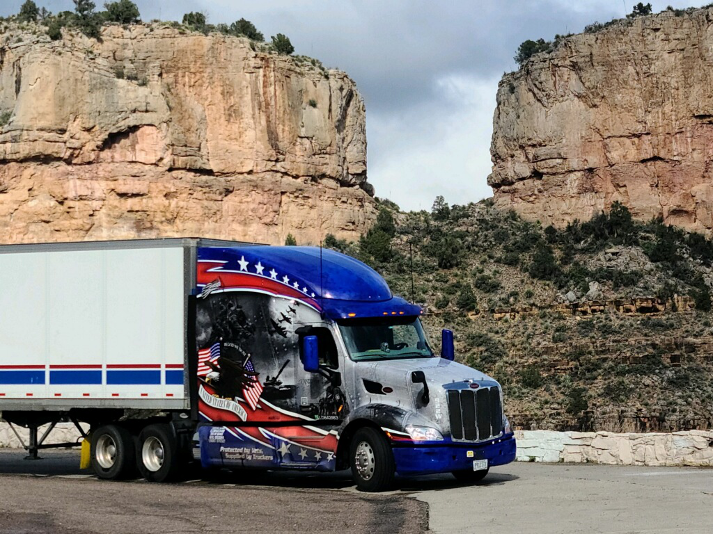


3. O say can you see
CARRIER: A.N. Webber, Kankakee, Illinois
GRAPHICS DESIGNER: Fastlane Wraps
A.N. Webber is an example of the all-American success story — a homespun “land of milk and honey” tale of what hard work and ingenuity can accomplish. In 1947, Albert N. Webber Sr. bought a 1941 KB7 International to haul stone from a quarry outside of Kankakee, Illinois, to various road and bridge projects. Nine years later, A. Neal Webber Jr. joined the company as a driver following a stint with the U.S. Army. The company currently includes four generations that “have always been truckers.”
Now boasting a fleet of 165 tractors and 400 trucks, the company’s patriotic package is an homage to those who paved the way in the home of the brave.
“From the top of the company to the bottom, we pride ourselves on recognizing and showing appreciation to all veterans,” said Jason Jarnagin, director of administration and compliance for A.N. Webber. “This truck is our pride and joy and stands for the patriotism that we preach on a daily basis. You can also see the truck in the background that sits out front of our corporate headquarters.”
WHY WE LIKED IT: “A.N. Webber’s trucks and trailers haul a strong message of U.S. veteran support and positive trucking image. The bold graphics, slogan: ‘Protected by Vets, Supplied by Truckers,’ sets this truck apart and the crisp, red, white and blue trailer detail continues the patriotic theme.” – Carolyn Magner Mason, Randall Reilly senior director of content

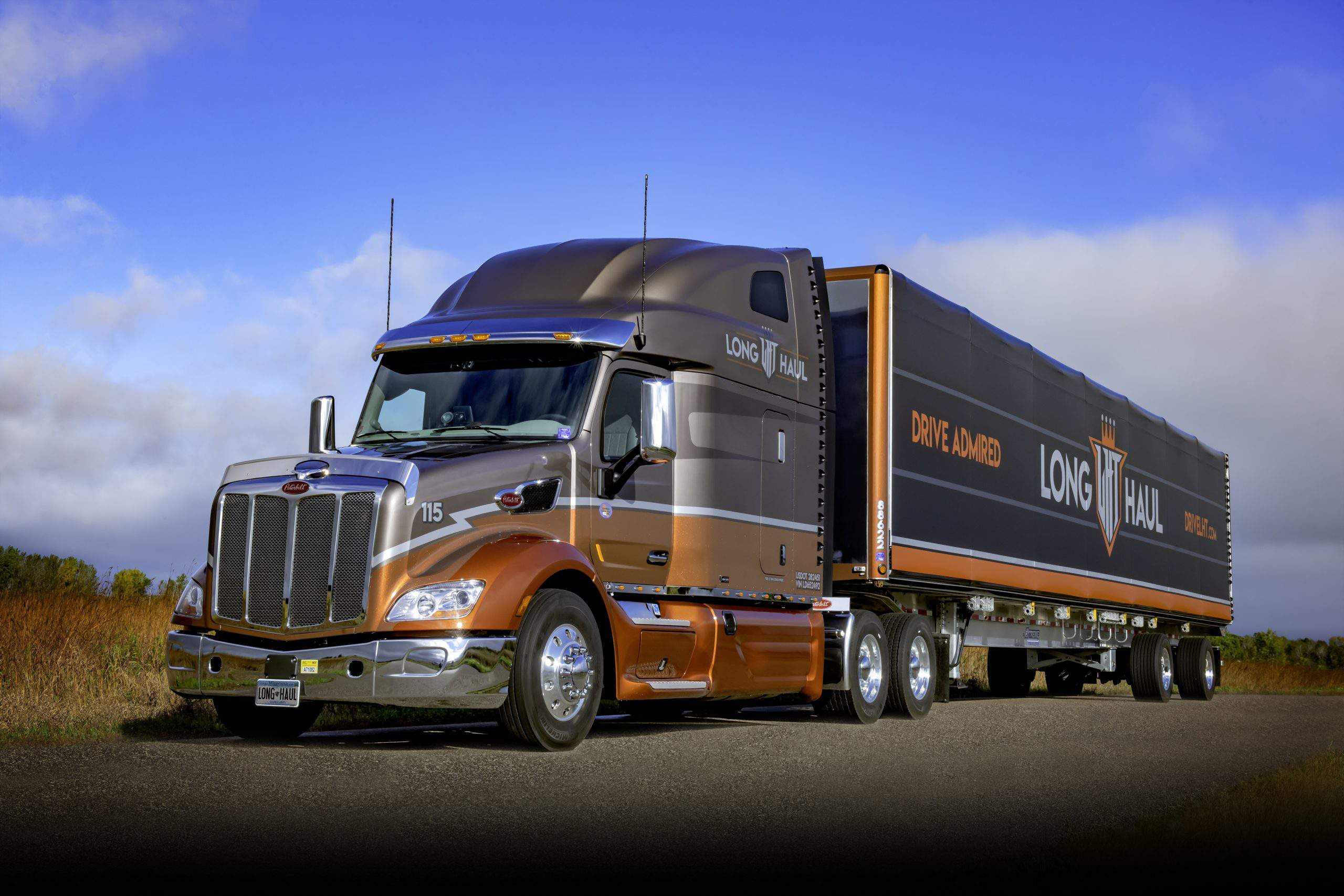


2. Simple yet effective
CARRIER: Long Haul Trucking, Albertville, Minnesota
GRAPHICS DESIGNER: Long Haul Trucking
For more than 30 years, Long Haul Trucking (CCJ Top 250, No. 233) has established itself as a prideful “you get more than you pay for” kind of carrier, and Anthony Book, the company’s vice president of sales and marketing, said the fleet’s look is a visual extension of that.
“We are trying to promote a message of value, empowerment and appreciation for our drivers and those who they share the roads with,” Book said of the carrier’s graphics package. “We aim to ensure that every driver in our fleet and those they encounter on the roads know that Long Haul is serious about trucking and believes that it’s a job that anyone should be proud to do.”
Book said the simple yet eye-catching scheme is also an outreach for the carrier’s customers. “We also want our clients to know that we take our role as a carrier they can count on to represent them well very seriously, and we invest in what we believe are the best trucks and trailers available to do so,” he said.
WHY WE LIKED IT: “Long Haul Trucking makes its equipment as attractive as possible to help improve driver recruiting and retention, and it shows. The company’s attractive, clean rolling billboards and the large display of the fleet’s name and motto on its trailer tarps beg for attention on the highway. It makes a strong-enough immediate, positive impression on the average four-wheel driver. Just imagine what it might do for another trucker thinking of switching fleets.” – Dean Smallwood, CCJ and Overdrive managing editor

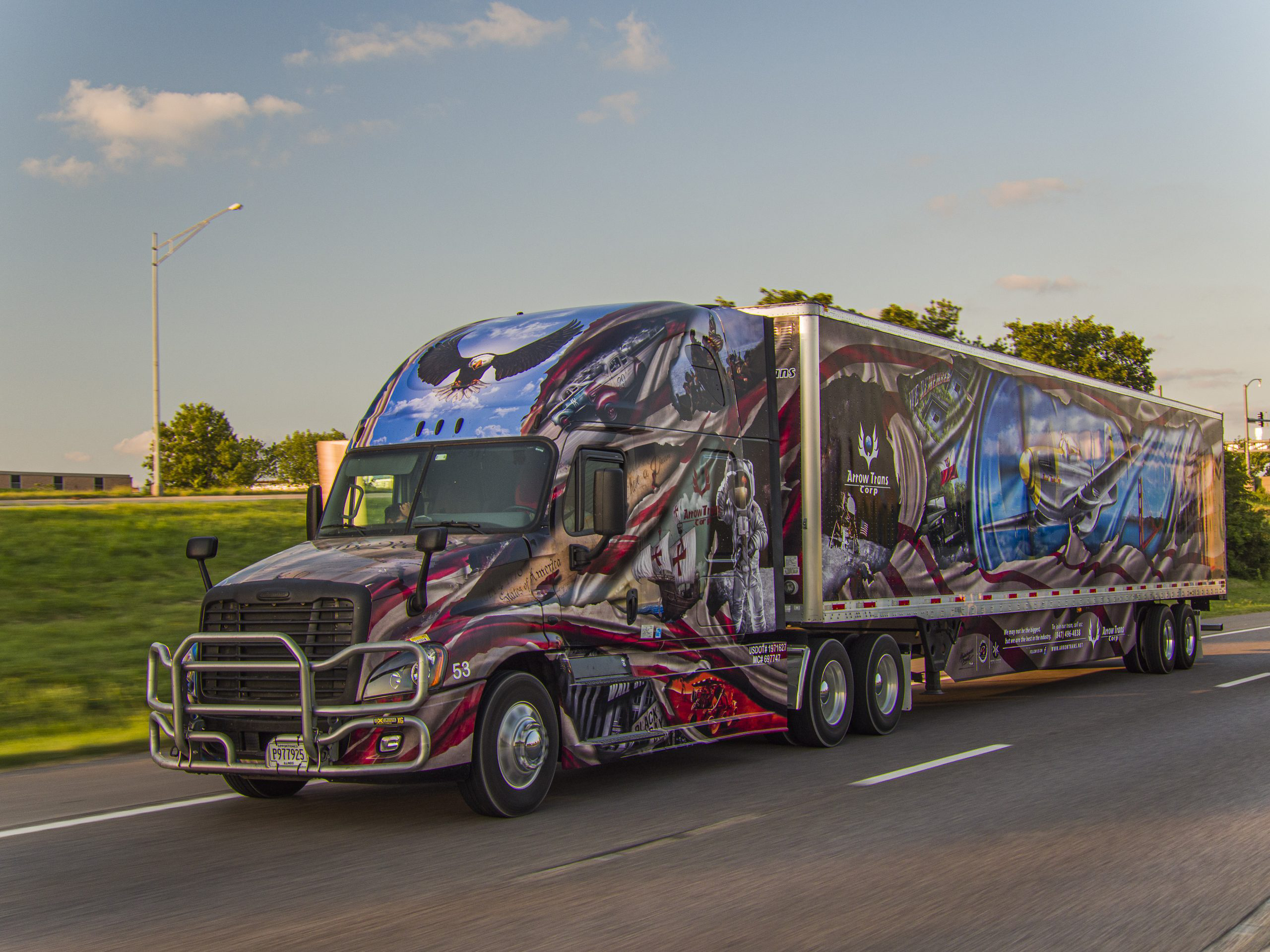


1. Rolling history project and homeland tribute
CARRIER: Arrow Trans Corp, Elk Grove Village, Illinois
GRAPHICS DESIGNER: Malachowski Project
Arrow Trans Corp. was founded in 2010 with one truck. Just 10 years later, the less-than-truckload, truckload, specialized, expedited and refrigerated carrier has 150 assets in its fleet, with three of them featuring artwork that marches passersby through U.S. history.
American-themed artwork is popular in trucking, but Arrow Trans Corp.’s approach makes it unique. The motive of the artwork on the company’s trailers is U.S. history “with its most important moments and historic sites,” said Pawel Raczkowski, marketing director, “but as a company founded and run by Polish-heritage people, this is how we want to pay tribute to our new homeland.”
The carrier’s graphics last year won the 40th annual Walcott Truckers Jamboree in the Custom Vinyl Graphics Combination category and Best Overall Theme.
WHY WE LIKED IT: “The graphics are eye-catching and cover the truck from edge to edge, ensuring your attention is secured, even at highway speeds. Each graphic is bursting with American pride from the Mount Rushmore, the moon landing, eagles, the Statue of Liberty, the Constitution, and more. Trucking and patriotism go hand-in-hand and the content caught my attention immediately. The graphics are absolutely stunning.” – Kelley Hoefle, Randall Reilly marketing communications manager