


Sustainability has a branding problem.
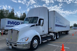
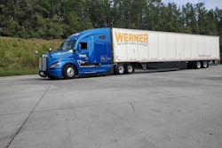
Marketing is all about product recognition. Icons like Pepsi, Coca-Cola, Apple, Tesla, Werner, Schneider, Knight-Swift, Ryder, Penske, Amazon, etc. are all easy to see. I’ve come to the conclusion that the primary problem with reducing emissions is that the majority of people just can’t visualize carbon dioxide (CO2).
Media coverage of catastrophes like tornados, hurricanes, tsunamis, volcanoes and earthquakes make those physical events real to everyone. A picture is worth a thousand words, or maybe now a million with inflation. Carbon dioxide and its effects are just hard to immediately visualize.
Measurements of thousands and millions of tons of CO2 are ubiquitous in press releases, news interviews and policy papers. The scale of these numbers is almost numbing. How do you visualize a million tons of CO2? How do you relate to that?
The measurement of CO2 is typically also stated in metric tonnes, often not clarified in the headlines. A U.S. ton is 0.91 of a metric ton, also stated as tonnes.
An example of visualization is the recent torrential rains in the Dallas-Fort Worth region. As much as 15 inches of rain fell in one 24-hour period in some locations. Averages over the entire metroplex region exceeded 9 inches as reported by CBS. That much water and its damaging effects are readily visible. Images and videos were broadcast all over the world.
The same day, I interviewed a freight company touting its aggressive sustainability goals. Their published plans are to reduce emissions by an additional 700 million pounds of CO2 a year by 2030. How do you visualize that? Is that a big number, a small number, or something in between? What do you picture in your mind when you hear or read these seemingly large numbers?
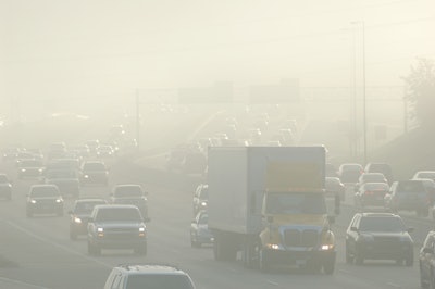
It is very difficult to visualize air. We can see air quality. We can see hazy days and clear days. The DFW area, for example, has a few orange Air Quality Index (AQI) days each summer when it’s considered “unhealthy for sensitive groups to be outside.” You can see the air on those days. During the initial lockdown days of the Covid-19 pandemic, the air quality was greatly improved in many cities. That visual scale of clear-to-hazy is understandable. You see it. But how do you visualize a ton of CO2?


A pound of air at sea level occupies approximately 12.4 cubic feet of space. To put that in perspective, a typical cardboard delivery box I get from Amazon or Chewy is about 2.1 cubic feet, so one pound of air at sea level is about six of these boxes. A ton of air then is equivalent to perhaps 12,000 delivery boxes. Putting that in terms of semi-trailers, a typical empty 53-foot semi-trailer is hauling approximately 274 pounds of air. It would take seven or eight semi-trailers to haul one ton of air.
Now CO2 is diluted in air. Part of that pound of air is CO2. One reference citing NASA data suggested that CO2 is 0.063% of the constituents by weight of air. One pound of air then has 0.00063 pounds of CO2. A ton of CO2 then coexists in approximately 3.2 million pounds of air. That is approximately 40 million cubic feet of air. Think of a ton of CO2 as equivalent to 11,600 empty 53-foot dry van semi-trailers hauling air.
The challenge with throwing around large numbers is that they are very hard to visualize. This occurs when the U.S. government funds projects that cost billions of dollars or the national debt being quoted in trillions of dollars. I was told once that an Aboriginal counting system was one, two, three, many. Beyond a certain point, the numbers are just big and the details are less important. That was probably a myth, but my point is that larger numbers have very little correlation to daily experiences that we can readily visualize.
When I read headlines about reducing emissions by millions of tons of CO2, I think, "Great! Progress is being made." A better visualization though is talking percentages, stating that the company is cutting their emissions by 30% or 50% or 100%. These are easier to grasp, I believe. They are also referenced directly to the company’s own baseline emissions.
A fleet of 1,000 trucks reducing emissions by 50% is much more meaningful to society than a fleet of five trucks reducing emissions by 50%. “Big” numbers are relative; what one fleet does in emissions reduction may dwarf progress made by a smaller fleet. Absolute numbers of pounds of CO2 reduced are then also very important; they are just more difficult to visualize.
There are alternate ways to visualize CO2. An MIT group describes a metric ton of CO2 as a cube 27-feet long on each side, where the CO2 is stored at standard atmospheric pressure.
Numbers and phrases can be hard to understand, hard to visualize and hard to agree on. Something as critical as CO2 emission reduction is hard to see. Making it easier to internalize should be an objective for every company establishing sustainability plans.
Tons – or rather tonnes – of CO2 is the quantifiable metric, but include what that means in terms of your own baseline and timing. Try to discuss what that amount of reduction may mean so it’s not just a big number, but rather is something easier to relate to.