


How a company’s trucks and trailers look can say a lot about the company as a whole. Well-planned and innovative fleet graphics largely project a positive image, while dirty and blank trailer sides, on the other hand, are wasted opportunities to tell a story.
Trucks and trailers are a carrier’s most visible – and most mobile – means of promotion and are a blank slate for showcasing a company’s heritage, its values and its strengths.
For fleets willing to invest the time and money, creating fleet graphics that relay a message can help connect them with customers, their community and worthy causes.
Since 1978, Commercial Carrier Journal has recognized excellence in fleet graphics design and execution.
The judges for this year’s competition included an 11-person panel from the editorial, art design and marketing staffs of CCJ and fellow Randall-Reilly publications Overdrive, Trucks, Parts, Service, Successful Dealer and Truckers News.
Each judge ranked their top five out of 37 submitted entries, and scores were weighted to determine a final ranking. The five submissions this year successfully relate the company’s purpose, tell a story, champion a cause or promote a strong corporate brand image.
—

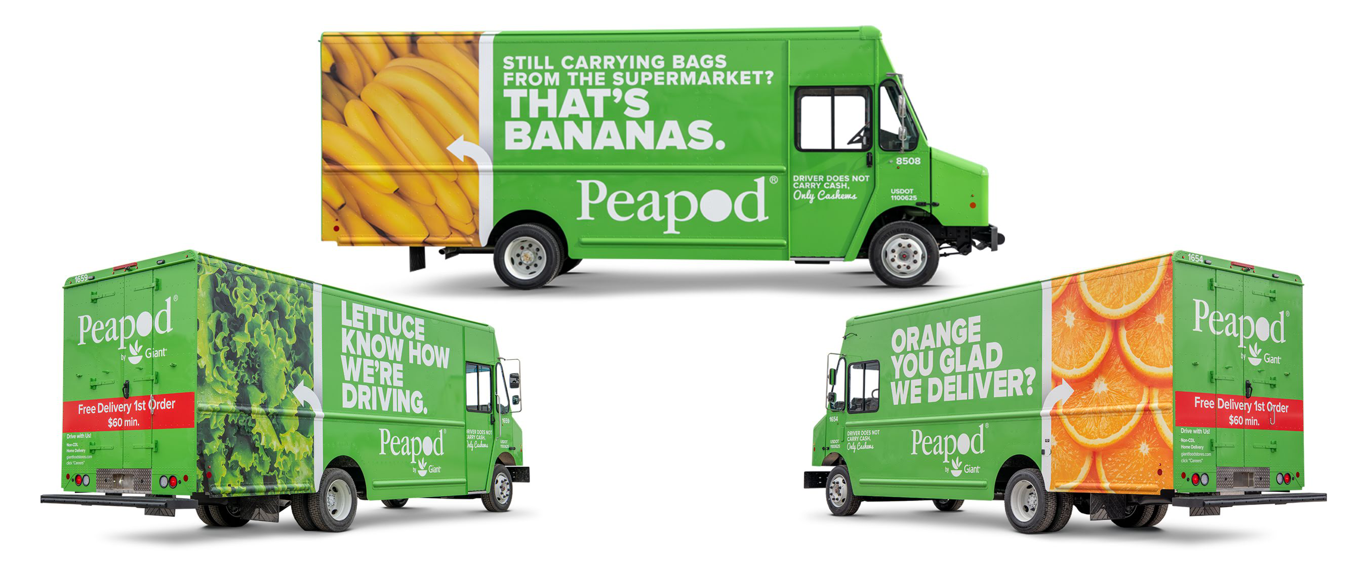

5. More than two peas in these pods
CARRIER: Peapod, Chicago, Ill.
GRAPHICS DESIGNER: Signature Graphics Inc.
Founded in 1989, Peapod is America’s leading online grocer with nearly 50 million orders delivered to-date thanks to its fleet of 500 trucks. Peapod’s trucks serve as a rolling billboard for the company’s services and their pun-heavy slogans show the company’s lighter side.
“Fresh products ordered online and delivered to homes… with a sense of humor,” said Trans Asset Sourcing & Design Manager Andrew Shook.
WHY WE LIKED IT: “I appreciate the simplicity of the design on this one. I’m especially drawn to the pictures of the different produce on the side of the truck. It creates a sense of freshness that goes with the clean design.” – David Watson, CCJ art director

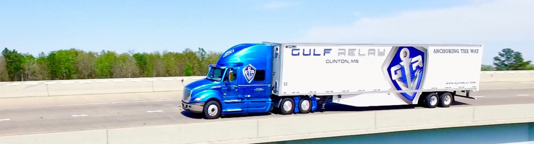

4. Anchors Aweigh
CARRIER: Gulf Relay, Clinton, Miss.


GRAPHICS DESIGNER: Gulf Relay LLC
An asset-based integrator, Gulf Relay prides itself on the equipment the company puts on the road. With an average tractor and trailer age of 1.5 years, the company equips its drivers with “home away from home” comforts on the inside and – on more than 80% of its 800 trucks and trailers – a style on the outside that drives home three of the company’s core values:
“Creativity, quality and dependability,” said CEO Douglas Hindman.
WHY WE LIKED IT: “You won’t mistake Gulf Relay’s trucks and trailers for any other company’s. Their graphics are simple and bold making them easily recognizable even at highway speeds. Their slogan, ‘Anchoring The Way,’ is catchy, makes sense and is easy to remember. Combined, the graphics, slogan, and choices of color and type font make Gulf Relay’s distinctive. They stand out from the crowd.” – David Hollis, Truckers News Editor

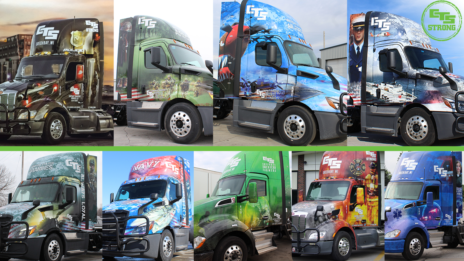

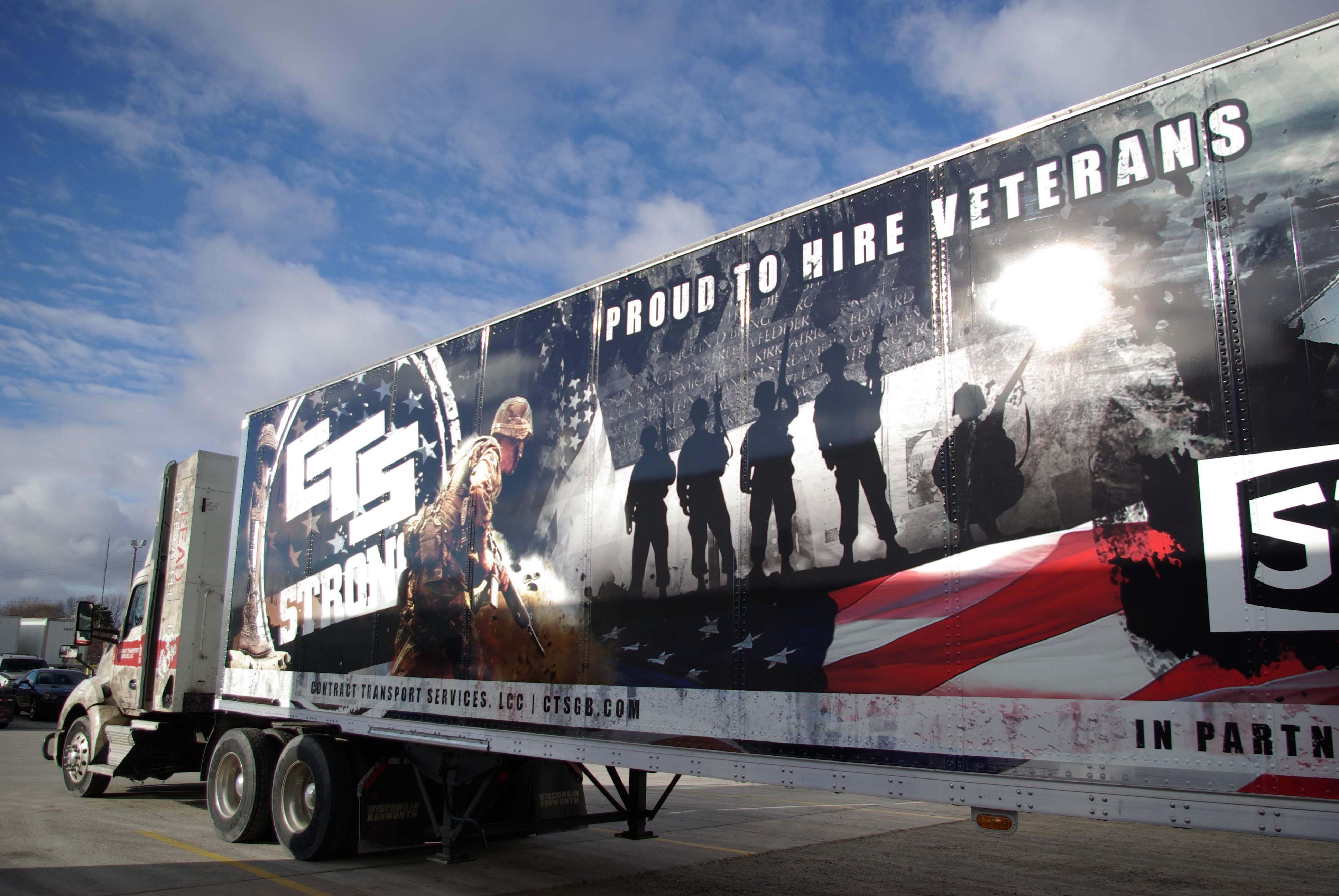
3. A salute to service providers
CARRIER: Contract Transport Services, Green Bay, Wisc.
GRAPHICS DESIGNER: Brand Outcomes
CTS began in 1985 as a single-truck operation doing cartage work for paper mills in the Green Bay area. It’s now grown into a 131 asset outfit with a strong focus on its customers and its community. President Curt Reitz says his company’s vision is “is to recognize people who do the right things” and “we proudly show our commitment and support to the thousands of men and women who serve this great country visually by utilizing trucks wraps within our fleet depicting branches of the military, police, firefighters, emergency medical technicians and farmers.”
Contract Transport Services backs up that visual presence by making monetary donations annually for miles completed by wrapped trucks to charitable organizations representing these groups.
WHY WE LIKED IT: “Trucking and patriotism have long been intertwined, with the industry employing a much higher percentage of military veterans than the general workforce. CTS’s graphics drive that point home, with their eye-grabbing graphics paying ode not only to branches of the U.S. Military like the Army, Navy and Air Force, but also to first responders like firefighters, police and EMS. It’s not just support of military and first responders that caught my attention, though — the graphics are stunning in their own right.” – James Jaillet, Executive Editor, Trucking

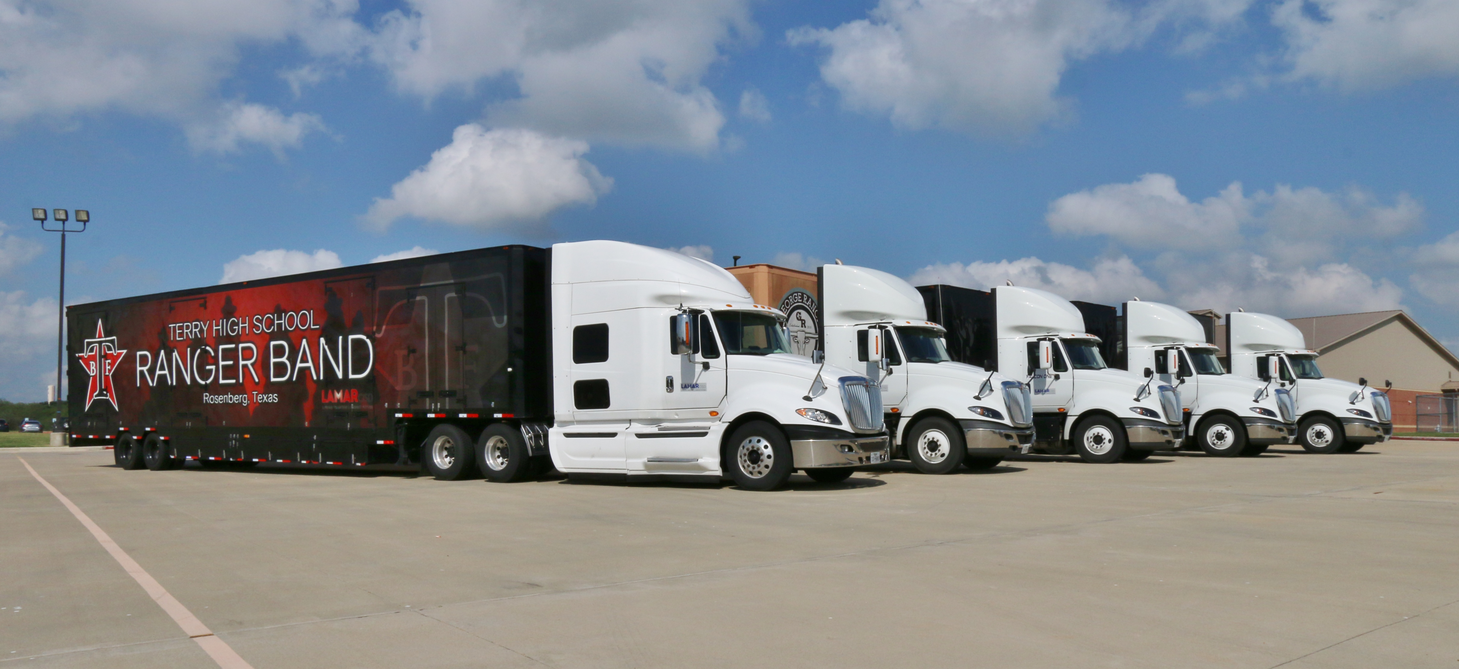


2. And the band played on
CARRIER: Lamar Consolidated Independent School District, Rosenberg, Texas
GRAPHICS DESIGNER: Clubhouse Trailer Company
Lamar Consolidated Independent School District is a public school district within the Houston/Sugar Land–Metropolitan Area. With nearly 35,000 students enrolled, it is the fastest-growing district in Fort Bend County and in 2018-2019 received the highest possible academic rating (A Rating) from the Texas Education Agency. LCISD uses its fleet of five branded trailers to support its marching bands while also promoting the schools.
“These trailers are designed to display the unique spirit and pride of our individual high school band departments while also showcasing our school district as a whole,” said Director of Transportation Mike Jones.
WHY WE LIKED IT: “The trailer graphics for each of Lamar Consolidated Independent School District’s five high school marching bands scream school pride. The intricate details in the graphics bring the schools’ mascots to life. There is no missing these trailers going down the road, just as there is no mistaking which school each represents.” – Matt Cole, CCJ News Editor

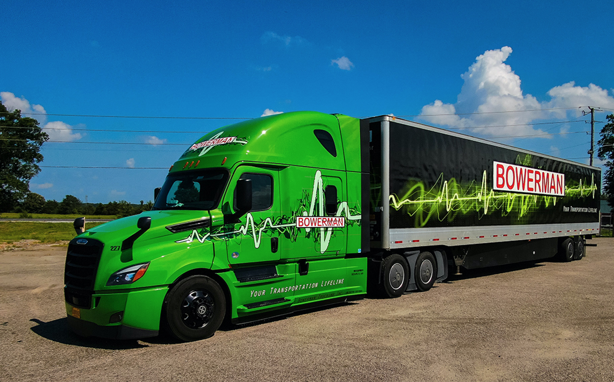

1. Green with envy
CARRIER: Bowerman Trucking, Inc., Searcy, Ark.
GRAPHICS DESIGNER: Bowerman Trucking, Inc.
Jimmy Ray Bowerman founded Bowerman Trucking, Inc. in 2000 as an owner operator of a hot shot rig. In February 2005 Bowerman Trucking, Inc., was granted operating authority and is putting some of the hottest-looking trucks on the road. Sixty of the company’s 65 trucks are branded in the company’s signature green, black and red along with 45 of its 130 trailers. CEO Matt Bowerman said the goal of his fleet’s graphics is to emulate “an attractive, modern and bold brand [and] image.”
“One that instills an unparalleled sense of pride in the drivers of the trucks and trailers and an equal sense of envy in drivers not yet driving them,” he said.
WHY WE LIKED IT: “From its bright green tractors to its pulsating trailer graphics, Bowerman Transportation stands out. By creating a visual complement to its slogan ‘Your transportation lifeline,’ Bowerman has developed a unique, immediately recognizable trademark. The Arkansas carrier has created an identifiable brand that will help differentiate the fleet for years to come.” – Lucas Deal, Trucks, Parts, Service Editor