


Your company’s image is its reputation. You know your company’s heritage, values and strengths, but chances are your customers don’t.
Innovative fleet graphics can say a lot about a company. Dirty, white trailer sides, on the other hand, are wasted opportunities to tell a story. For fleets willing to spend the time and money, creating fleet graphics that relay a message or tell a story can help connect with customers, communities and worthy causes.
Since 1978, Commercial Carrier Journal has recognized excellence in fleet graphics design and execution.
The judges for this year’s competition included a nine-person panel from the editorial, art design and marketing staffs of CCJ and fellow Randall-Reilly publications Truck Parts & Service, Successful Dealer and Truckers News.
Each judge ranked their top five out of all submitted entries, and scores were weighted to determine a final ranking. The five submissions this year successfully relate the company’s purpose, tell a story, champion a cause or promote a strong corporate brand image.
Here are this year’s Five Flashiest Fleets:
—
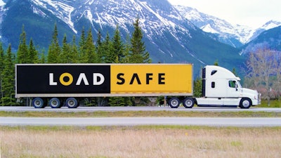

No. 5: Simple Symbolism
CARRIER: LoadSafe Crossborder Freight Inc.
GRAPHICS DESIGNER: Vickers Design Though you may not have heard of it, LoadSafe Crossborder Freight isn’t the new kid on the block. The 40-truck fleet from Calgary, Alberta,
has been around since the 1970s under a family name. When the last family member left and the business was purchased by Rick Russell and his son, a change was in order.
“Finding a name that describes a trucking company that isn’t already used is really tough,” said Russell, adding any name
he chose “should be catchy and also should describe what the company does.”
The trailer color scheme mirrors yellow-and-black road safety signs, while the white line represents the U.S.-Canadian border. The “A”s mimic a perspective view of highway lanes merging on the horizon, and the “O” represents a wheel in motion.
“We pick the load up when we say we are going to, deliver it when we say we are going to, and we don’t wreck it,” Russell said. “We have 40 trucks and do more than 4,000 loads a year, and I can count on one hand the number of freight claims we’ll have in a year.”
WHY WE LIKED IT: “I appreciate this graphic says a lot without being too busy. A lot of thought went into incorporating the company’s commitment to safety and helps support the reputation it is building as a reliable cross-border trucking outfit.” —Jeff Crissey, CCJ editor
—
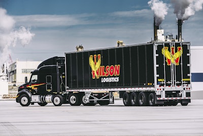

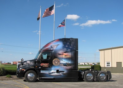
No. 4: Ready to soar
CARRIER: Wilson Logistics
GRAPHICS DESIGNER: Wilson Logistics Wilson Logistics is one of the fastest growing trucking companies in North America and now has 800 tractors and more than 2,000 trailers.
The contrasting black, yellow and red color scheme can be found on 550 of the Springfield, Mo.-based company’s tractors and 400 trailers.
When the company entered the heavy-haul business in the Pacific Northwest last year with the purchase of Haney Truck Lines, Wilson Logistics wanted to make the statement to its customers, drivers and community that it wasn’t interested in maintaining the status quo.
“We’re not looking to blend in,” said Michael Ensminger, Wilson Logistics marketing manager. “We’re looking to stand out — not just on the road, but with our commitment to safety, our service to our customers and how we treat our drivers. Our all-black and well-maintained equipment helps us achieve this.”
WHY WE LIKED IT: “This is a comprehensive, distinctive and striking overall presentation. Black is a powerful color and an ideal background for the bold red and yellow logo. And the logo itself is unmistakable. So combined, this makes for an ideal and easily recognizable representation of and for the company.” — David Hollis, Truckers News editor
—
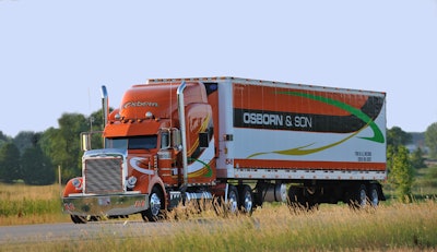

No. 3: Big Orange
CARRIER: Osborn & Son Trucking
GRAPHICS DESIGNER: Osborn & Son Trucking
Although it was incorporated officially in 1948, Osborn & Son Trucking’s roots date all the way back to 1898 when Freeman Osborn started hauling goods by horse in Fond du Lac, Wis. Through the generations, Osborn has grown to a fleet of 60 power units that haul cheese out of Wisconsin and bring back spices, imported liquor and cheese from the East Coast.
Today, 58 Osborn tractor-trailers are adorned with the striking orange, black, white, green and yellow color elements that swoop from the tractor to the trailer.
“We take pride in our equipment and the services we provide,” said Kristina Koch, human resources director. “We have been in business for 120 years, and we are known for our ‘Osborn Orange.’”
WHY WE LIKED IT: “The bright, bold colors and graphics package are eye-catching, and including the trailer and reefer unit adds layers of detail that complete the package. I like that the scheme is carried over from the cabover to the conventional, subtly reinforcing the “& Son” part of the business. You can almost envision the Osborn lineage with the COE a generation ago and the conventional today.” – Jason Cannon, CCJ equipment editor
—

No. 2: The fight for freedom
CARRIER: Garner Trucking
GRAPHICS DESIGNER: Hogrefe Illustration & Designs Findlay, Ohio-based Garner Trucking was founded in 1960 by Vernon and Regina Garner. The company is still a family-owned and -operated business that operates on a number of beliefs and core values, including a commitment to honoring the sacrifices made by U.S. military veterans.
Garner proudly participates in the Wreaths Across America campaign that lays wreaths at more than 1,400 cemeteries across the country every December. Three years ago, the company commissioned a “Freedom Truck” design and honors its Driver of the Year recipient with the opportunity to drive one of the specially wrapped tractors.
“These trucks tell the story of America,” said Jenny Schaub, marketing coordinator. “Freedom I’s graphics include various American monuments. Freedom II’s graphics focus on military vehicles throughout the years, and Freedom III’s graphics focus on military families and servicemen.”
WHY WE LIKED IT: “The American flag fading into the background of each military vehicle initially jumped out at me. Then my eyes went to the black and white picture on the front panel commemorating Pearl Harbor, which is a nice contrast from the rest of the truck. The center placement of the U.S. seal tops off this patriotic-themed rig.”– David Watson, CCJ art director
—
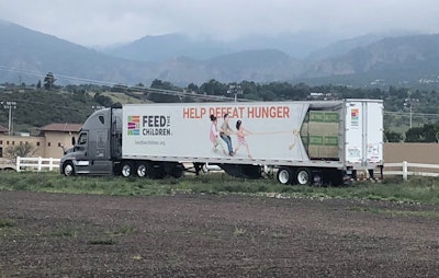

No. 1: Putting children first
CARRIER: FTC Transportation
GRAPHICS DESIGNER: Feed The Children FTC Transportation primarily serves Feed The Children, a charitable organization that connects donors with community leaders to stamp out childhood hunger. The carrier accepts third-party loads
for backhauls and when not delivering Feed The Children freight. “As the core carrier for Feed The Children, we are working to help fulfill their mission of providing hope and resources for those without life’s essentials, and their vision to create a world where no child goes to bed hungry,” said Emory Mills, director of safety and driver administration.
FTC Transportation’s innovative culture has garnered the small-but-mighty fleet a number of industry awards and recognitions over the years. That innovation also is exhibited in its Feed The Children trailer graphic.
The integration of the “Help Defeat Hunger” call to action and children pulling back the trailer side to expose boxes of food are sure to evoke an emotional response from other motorists.
WHY WE LIKED IT: “It is immediately eye-catching. The design draws your attention to the campaign. I am a big believer in using your vehicles to promote your company or mission, and this design absolutely does that.” – Lucas Deal, Truck Parts & Service and Successful Dealer editor