


Since 1978, CCJ has been pleased to recognize excellence in fleet graphics design and execution. The judges for this year’s competition included the editorial staff from CCJ and its sister-publications Overdrive, Clean Trucking and Trucks, Parts, Service. Each judge scored all submissions on a scale of 1-10, with 10 being the best, and scores were averaged to determine a final ranking.
1. Arizona Beverage

At AriZona Beverages’ Keasby, NJ plant, even the yard trucks make a statement. Dressed in the brand’s signature vibrant artwork, these custom-decorated trucks transform the yard into a gallery on wheels. Proof that AriZona’s creativity doesn’t stop at the can, but drives through every part of its operation.
Arizona Beverage effectively extends its colorful, playful can designs and marketing visuals to its yard tractors. This smart move seamlessly expands the company's distinctive branding across its fleet. It's refreshing to see a company that not only excels at marketing its products but also understands the broader power of branding. The eye-catching vehicle designs give warehouse employees and drivers a sense of pride on the job, too. By blending art and brand identity, Arizona Beverage has created a truly winning livery. – Jay Traugott, senior editor, Clean Trucking

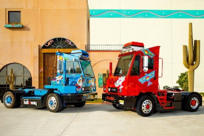
2. Champion Tire & Wheel

NASCAR teams rely on the dependability and precision of Champion's tires, wheels, and equipment in order on race weekend. When the last set of tires goes on the car with a couple of laps to go they know Champion gave them the right tools to succeed.
Champion’s tractor wraps show variations on a design customized for individual race venues. Tractor colors and lines in each extend to the well-designed though very different van wraps on the trailers each pulls. Products and/or organizations each trailer is intended to advertise – and the design of the wrap -- vary considerably, yet the designers manage to maintain color/line complements between tractor and trailer on all. Overall, it’s a well-executed scheme that places emphasis where intended, away from the utility of the truck to the businesses served. – Todd Dills, chief editor, Overdrive

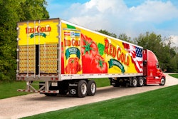
3. Agri-Mark/Cabot

Cabot Creamery is a farmer-owned, Certified B Corp that has been producing award-winning dairy products since 1919. With this colorful and thoughtful graphics design, you'd never mistake them for anything else.


Nothing catches my attention like a giant block of cheese and here, they’ve managed to take advantage of the trailer’s cheese-block shape without being too obvious. The Cabot branding that serves as the background conveys meaning and heritage without being too busy, letting the product — cheese — shine. The subtle nod to the checkered pattern from the wrapper is extra sharp. – Beth Colvin, associate editor, Truck, Parts, Service

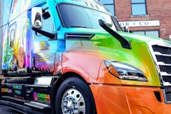
4. Hirschbach

Hirschbach's trailer graphics tell the story of who Hirschbach is: a Veteran-owned company that honors service and stands out with a culture that is “Not Your Typical Trucking Company.” Each year, the company recognizes a Veteran within its fleet by allowing them to design a custom wrap that reflects the military branch they proudly served, ensuring their service is represented on the road. These military-wrapped trucks are a moving tribute to the dedication, sacrifice, and resilience of our Veterans, while also reinforcing our deep-rooted commitment to those who have served our country. Alongside these tributes, Hirschbach's distinctive graffiti art showcases the creative and genuine spirit that sets the company apart. First introduced at a local art event in the carrier's hometown of Dubuque, Iowa, this bold artwork has since become a rolling symbol of innovation and authenticity across the fleet. Together, these designs represent the brand: honoring the past, celebrating individuality, and driving forward with a culture that is anything but typical.
You would know a Hirschbach Motor Lines truck from a mile away with the bright orange and red markings, reminiscent of the company’s 1970s fleet pictured on their website. Standing out against the white backdrop of a trailer is an abstract graffiti design of red, orange and black behind the Hirschbach logo – a design that is consistent with the exterior walls of its Iowa terminal. When it departs from that style, the company makes its veteran-owned status known by featuring several military-themed trucks with skins that highlight patriotic images. Overall, the brand’s look is one that highlights one of the company’s core values: having fun. – Angel Coker, senior editor, CCJ

5. Brakebush

This is a very special trailer graphic in Brakebush's fleet. The motor carrier currently have two Wreaths Across America (WAA) trailers with plans to add another. It is special to Brakebush because it not only honors and supports WAA and the families of the fallen, but also the Marine that is being carried to rest is from Wisconsin, where Brakebush is based. Sgt. Andy Stevens and the pallbearer on the right rear was one of the company's dispatchers who lost his life after complication from Covid. The trailer skirt tells the story behind it. The family was able to visit the terminal in Wisconsin to see the trailer that honors their son and they know what WAA means to so many families.
The design balances impact with dignity. It’s eye-catching and mission-driven without being exploitative. The graphics serve as a way to honor patriotism and express gratitude. There’s an emotional response to that, and in turn, creates an impression and makes the truck stand out. – Pamella DeLeon, senior editor, CCJ